
End to End Tracker
Streamlining Customer Onboarding Across Siloed Teams
Role: Lead UX & Product Designer
Context: B2B | Internal Desktop Application | Banking & Finance
🧠 The Challenge
HSBC, a global banking leader, onboard thousands of new personal and business customers daily. Each onboarding requires multiple, essential security checks performed by different specialised teams using isolated tools. This siloed system caused delays, bottlenecks, and a lack of clear insight into where issues arose—impacting efficiency and customer satisfaction.
⚽ Strategic Goal
Create a unified internal desktop application that enables Client Relationship Managers to monitor and track every step of the onboarding process in one place, supporting faster decision-making and smoother conflict resolution.
🎯 Design Objectives
Consolidate fragmented onboarding data and processes into a single, easy-to-navigate dashboard
Enable real-time monitoring of customer onboarding status and potential bottlenecks
Provide user account and permission controls aligned with internal security standards
Integrate seamlessly with existing HSBC brand and systems

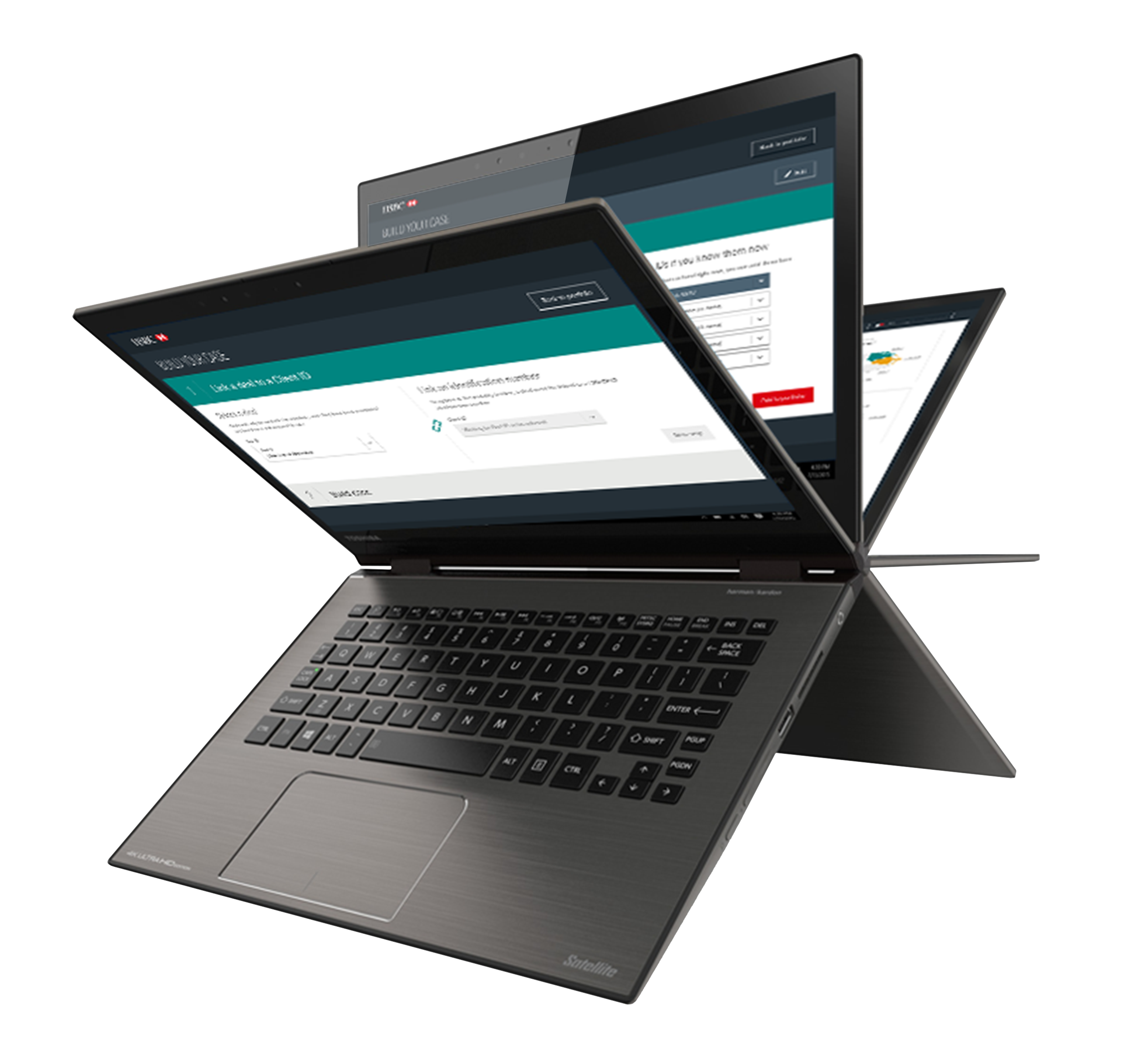
✍🏼 Wireframes
🧭 Approach & Methods
🔍 Research & Strategy
Persona creation focusing on Client Relationship Managers
Workshops and interviews with CRM teams and departmental experts
Market research on best practices in process data visualisation
Alignment sessions with Product Owners and Developers
Continuous business goal validation
🔧 Design & Prototyping
Mapping user flows and onboarding processes
Wireframing and iterative ideation sessions
Prototype development for desktop environments
Moderated on-site quantitative user testing with CRM teams
📤 Takeaways
Refine data layout on customer tiles to improve scanability at a glance.
Display active customer counts and clear status indicators on tiles.
Ensure existing client data is surfaced within selection fields for efficiency.
Introduce personalisation options to support different user workflows.
Replace persistent help text with on-demand guidance to optimise screen space.
🎨 Final Design
Evolution of the data flower
✨ Key Design Solutions
Area
Solution
Impact
Consolidated overview with real-time status tiles
Dashboard
Faster bottleneck identification
Scannable customer tiles with key info highlights
Data Presentation
Improved user scanning and prioritisation
Permission and account management
User Control
Secure, role-based access
Embedded brand style and system interoperability
Integration
Smooth adoption across teams
📈 Outcomes &
Business Impact
Metric
Result
🤗 New customer onboarding efficiency
↑ 63% reduction in process time
👎🏼 Customer complaints
↓ 23% due to fewer delays and errors
100% uptake by Client Relationship Managers
🔨 Tool adoption
🔄 What I Learned
🧪 Before Testing
Each department used different platforms, complicating unified tracking
Only Client Relationship Managers were open to changing workflows
🥇 After Testing
Users wanted the dashboard to “work harder” with more actionable insights
Customer tiles became hard to scan beyond five active cases
Users requested access to existing customer data during new customer additions
🧠 Strategic Takeaway
Designing internal tools for efficiency isn’t just about visibility—it’s about adaptability. While Client Relationship Managers were willing to adopt a new process, the tool’s success hinged on presenting the right data at the right time, in a format that fit their fast-paced workflow.
User testing revealed a strong need for scannable, action-oriented dashboards, access to existing data during task creation, and personalisation to match working styles. Streamlining clutter—like persistent help text—was also crucial for frequent users.
The project reinforced a key principle: internal tools must be just as user-centred as external ones. When thoughtfully designed, they not only improve task efficiency but also drive cross-team alignment and adoption at scale.
